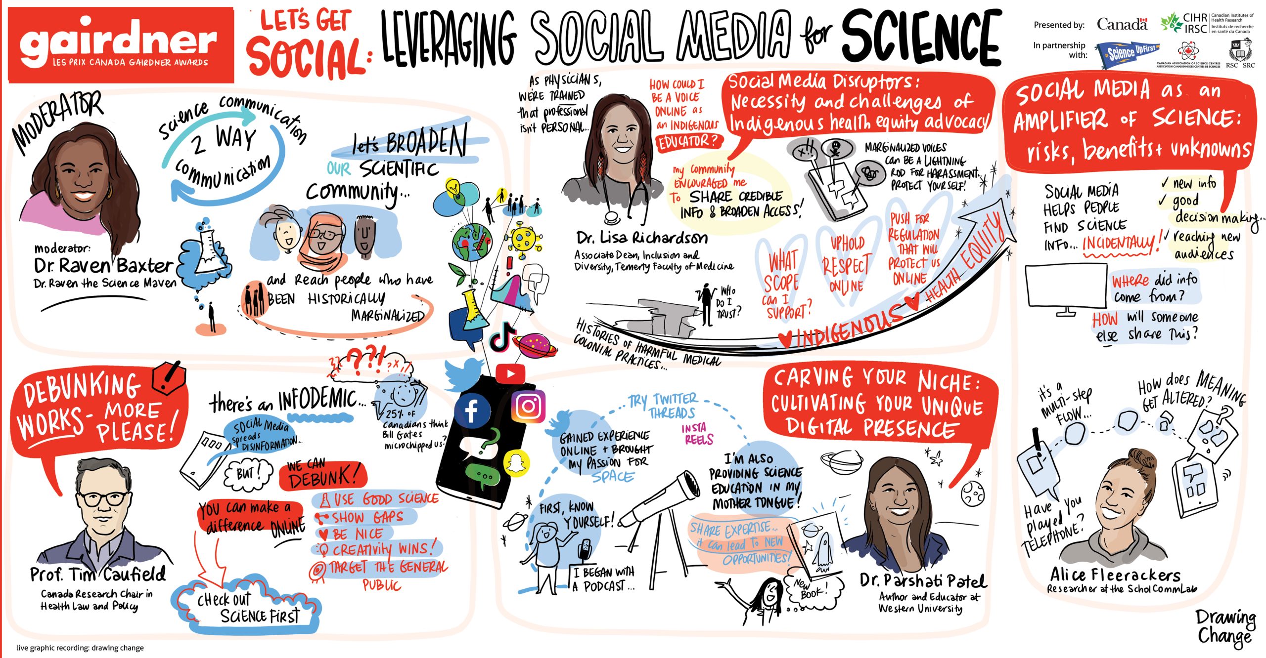
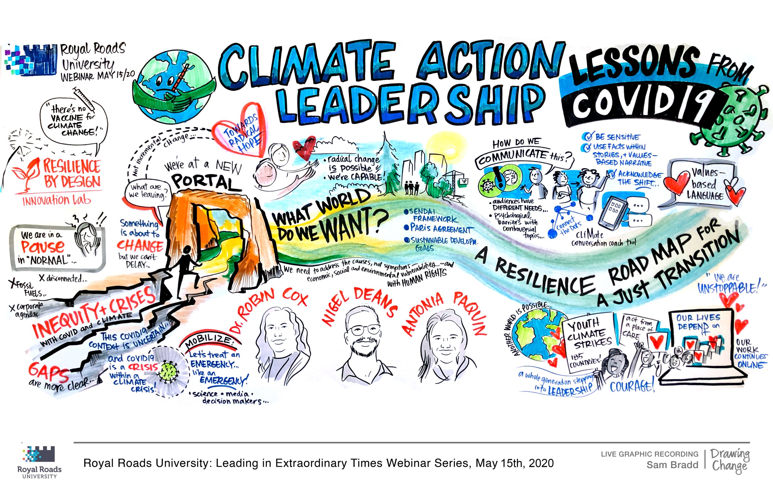
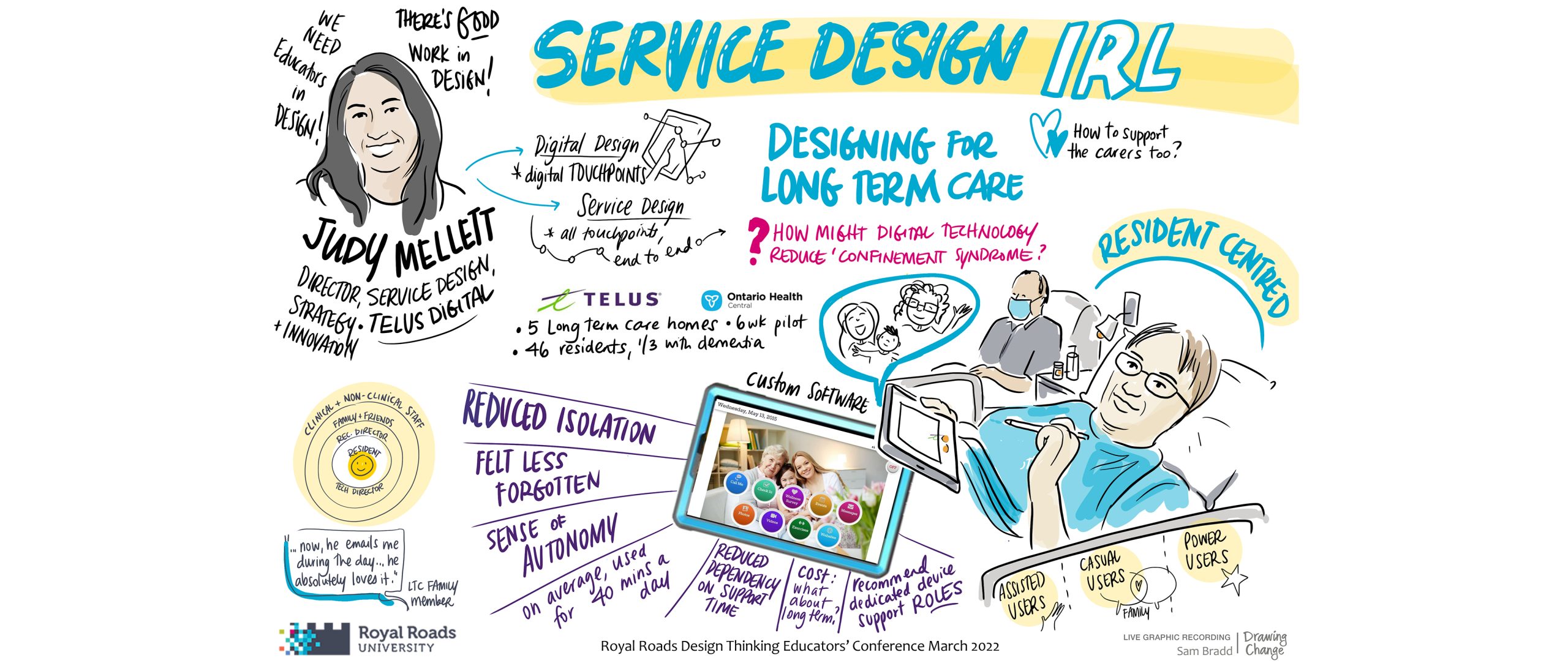
Graphic recording: great layouts and planning for success
Every so often a client will tell me about a bad graphic recording experience: it wasn’t readable or it didn’t make sense to them, so they didn’t see the value. It doesn’t need to be this way! Clients, participants and graphic recorders all need great layouts to provide a flow of information, elevate decisions, and provide context. It’s a wonderful challenge to meet when we are graphic recording in real time – but our work is never ‘just show up and draw”. Before every project, we plan with a library of resources and with the facilitation team so our visuals are coherent – and they can do their best work facilitating both process and product. Here are seven techniques to demystify great graphic recording layouts, and plan for success:
- Get familiar with models
- In complexity, work with Containers, Differences and Exchanges
- Anchor images
- Learn different charts types
- Types of metaphor
- Pace yourself wisely with the agenda
- Review your work and introduce new shapes
Get familiar with models
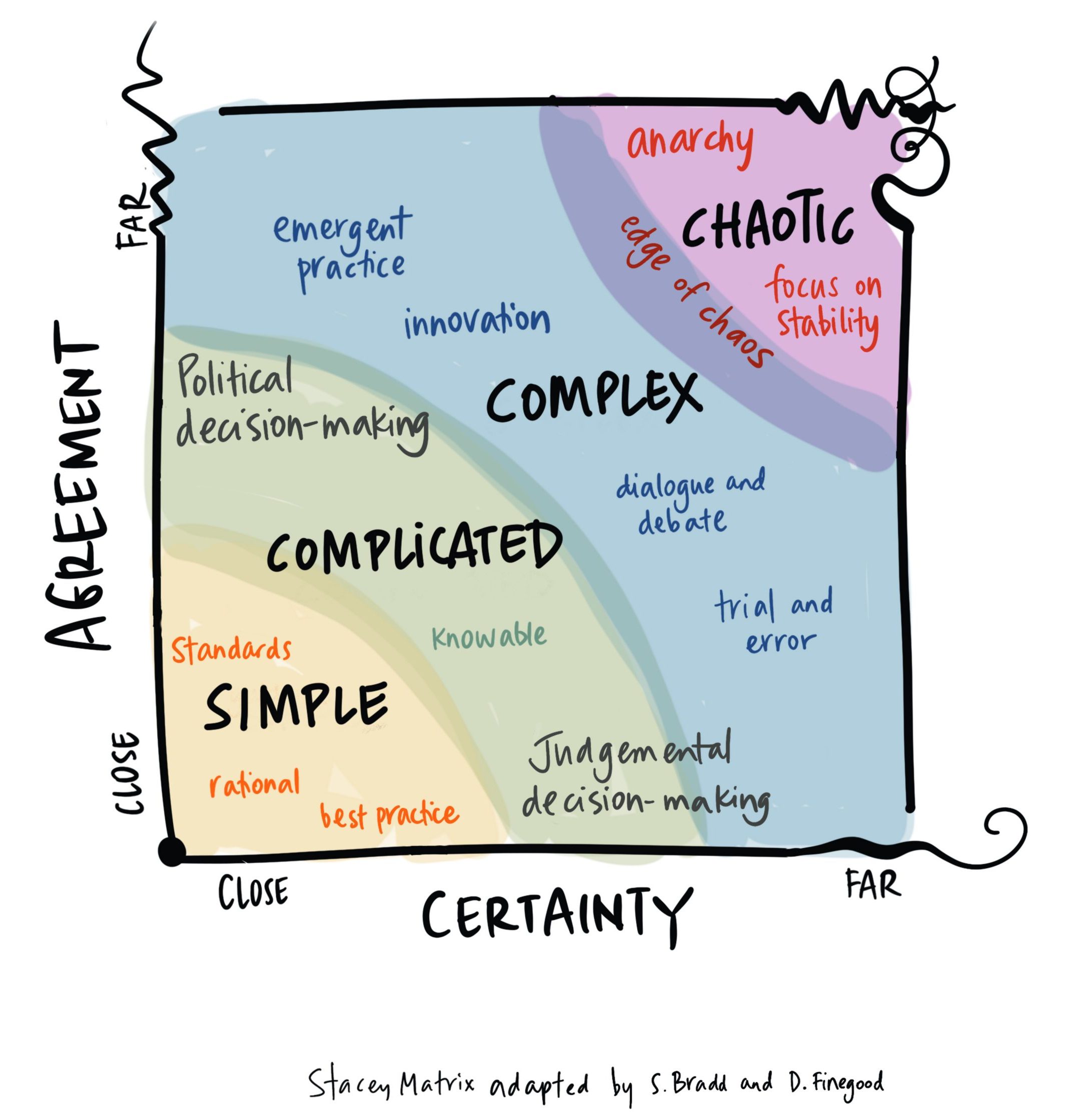
Models facilitate a conversation by giving it a shape: you might recognize 2×2 matrixes, Venn diagrams, icebergs for example. Models underpin theories everywhere – business, organizational development, leadership, education and more.
I imagine models in 3 types of challenge:
- recreate and draw types of diagrams and models while they are being presented to the room
- transform models and add personalized meaning for the group in real-time
- creating or co-creating brand new models with participants
It’s less about memorizing shapes and more about knowing the purpose of models: when might you need a conceptual (exploring ideas) model, or a declarative (more data-driven) model.
In complexity, work with Containers, Differences and Exchanges
Graphic recording is a very useful tool for systems thinking, so let’s apply a Constraints, Differences and Exchanges model from Human Systems Dynamics for improving our graphic recording layouts.
Containers “hold the system while patterns form.” There are containers in the system/meeting being talked about, and there are also containers (of and) on the page. These containers can always be expanded or contracted. If your graphic recording needs more organization and structure, try constraining the container with different shapes, a more limited palette, clearly defined limits, more detailed or specific people, and lists. And If you need to relax the drawing in some way, then look at expanding the container. Softer shapes, less text in boxes, more colours, bigger paper/pages, simplified human shapes, and importantly more illustration if you have a tendency towards text-heavy scribing.
Containers hold the system, which also means the type of meeting container will also influence your graphic recording. Do you find that during presentation-heavy, dense meetings your graphic recordings get more and more squished with details? Maybe one graphic recording approach could be for your intention to hold an expanded sense of the container, with spaciousness on your page, instead.
Differences hold tension, and it’s about the “differences that make a difference”. Differences in the system show where there is potential for change. Graphic recording is movement, emergent, dynamic and a tool for visualizing change. We can highlight differences with more visual contrast:
- White space: Increase the white space, so the differences you highlight have the right visual size and it stands out. Increase the page size if necessary, or draw less on each page
- Text size: ensure contrasting text sizes to indicate emphasis
- Details of people: is there a way of drawing people or portraits in this project that could highlight what is being called for? Representation with diversity and inclusion?
- Colour: colour and palette choices help show sameness or difference. Complementary colours (eg red/green) can indicate contrast, whereas a cool palette (eg all blues) will indicate more sameness
- Catalyst: is there a turning point in the conversation? Can the graphic recording show that ‘aha’ moment, what led to it or comes after?
Exchanges are a flow that “generates change in a system”. Graphic recording can show the connections between ideas, information, people, and more. Visualizations can work to name decisions, pathways, and choices – how information or energy is moving. We can visualize these exchanges with different techniques, such as with metaphors like a pathway or destination. It’s not just about adding more arrows – you’ll end up with a diagram of spaghetti.
You could also increase the exchanges in the room by inviting participants to engage with the graphic recordings – the images can help facilitate conversations in pairs or small groups as well.
Anchor Images
Avoid icon-itis. This is Brandy Agerbeck’s brilliant term for the limited, ‘ binary thinking of turning any phrase into an icon’. Instead, mix things up with the occasional anchor image or large illustration. They bring impact, and make the topic clear at a glance.
Anchor Image benefits:
- Iteration: I slow down, brainstorm complex concepts and improve my thinking
- Customizable: I might bring in 5 sketches for 5 table topics; I commit them to the page and customize them once I’m working live and immersed in the meeting
- Keeps the ratio of illustration-to-text balanced when the meeting has a rapid-fire report out
A caution: please don’t pre-draw large anchor images unless you’re absolutely certain they are appropriate (don’t base it only on the title of a keynote!)
Name that chart: learning from data visualization
Learn names of different data visualization charts for more varied layouts. Pie charts, bar graphs and other common choices are familiar and safe, but can feel repetitive. On the other hand, switching to a complicated data visualization (exported R-graph scatterplots, I’m looking at you) doesn’t guarantee that your audience will understand. This is a funny recap of the pitfalls of different charts (hey, I drew Hans Rosling once) and what is Chart Junk , so you can present data well. Then if a presentation has a long bulleted list of statistics or the slide is unreadable with many colours, you can improve it in your graphic recording.
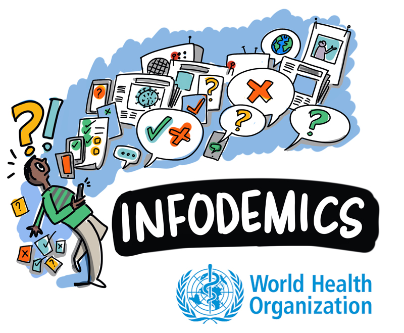
Data visualization is an academic and professional field of study , with experts on layout, colour, and approaches that graphic recorders can learn from. And the more skills we have with visual presentations and managing information, the better we can address online infodemics.
Metaphor
Metaphor is foundational to graphic recording – if a picture is a thousand words, then a metaphor can help paint that picture.

Here’s a few categories of metaphors that might structure a page:
- Nature: rivers, mountains, trees/forest, pathways
- Mechanical: roads, conveyor belts
- Social: a sport, food
- Abstract: venn diagrams, arrows
- Cultural or place-specific: varies widely and not all metaphors are interchangeable, but I have been asked to draw specific metaphors like canoes, woven baskets, specific animals, geographic landmarks
Metaphors are a starting point and also, all metaphors break down. Groups won’t always reach consensus (we’re like a tree! We’re like a forest! No, we’re a garden!) but remember the purpose is to facilitate a conversation or greater understanding of the topic at hand, whether the metaphor sticks or not. If you’re designing a more permanent product, like a visual strategic plan with a central metaphor, talk it through with the client first.
Pace Yourself in the Agenda
Improve your graphic recording layouts by analyzing the agenda, and planning out the approach with the facilitation team. Remember you can be a trusted thought partner. This conversation enables us to know which sessions benefit from more divergence and detail, and which sessions ask us to distill and highlight decisions. Analyze the agenda and your graphic recording pacing, because options for a full day conference are endless:
- One summary poster of the entire morning/afternoon (less detail)?
- Smaller posters for each short keynote/presentation/ panel, can they be combined?
- A separate poster to highlight the decisions from the final brainstorming session?
- Multiple posters to wrap the room in the groups’ conversation, emphasizing process over product?
There’s no wrong approach – just remember you’ll need breaks to do your best work. If you spot an agenda with 15 presentations and breakouts, you’ll need some techniques for success and maybe a colleague or two. I have a chapter in this book which goes into more detail about planning agendas, as well.
Review your own work and introduce new shapes
To improve your layouts, first gather a selection of your own graphic recordings.
What do you see? Do you have a tendency to use one shape, container, or way to link ideas? Are you feeling stuck with the same types of mark-making tools? Is it a particular agenda type that is hardest?
So What … does it mean? What insights do you now have?
Now What…. What small experiment might you try as a result?
I hope that with these techniques – in addition to the ones that you already are using – you’ll elevate your graphic recordings into layouts that are clear, beautiful in their thinking, and importantly – effective for the people you’re working with.
Inspiration for this post comes from teaching the Drawing Change signature training course this week. We’re sold out for 2022 so reach out to get on the list to be personally notified for our 2023 trainings. You’ll have choices of online or in-person trainings in 2023 – and I’m excited to meet you, visual thinker!