Judging the 2015 CALM awards: Canadian Association of Labour Media

I’m in Victoria, BC to judge the 2015 Canadian Association of Labour Media awards once again.
I evaluated the visual categories including best poster, best infographic/illustration and best overall print excellence. Congratulations to everyone – there were so many excellent submissions that we had a tie and numerous honorable mentions.
The poster category blew me away. Have you ever been shown a stack of historical labour movement posters, maybe hauled out from the back of a storage closet somewhere? Large, colourful, beautiful hand-lettered text. Old labour movement posters also have a tradition of original art on them. The kind of poster you want to frame for art’s sake, and not just for the message and call to action. Sometimes we rely too much on computers to make posters for us, in a way that ends being digitally cold. This year, the CALM winning posters are digital, but also art you want to frame. It’s a great example of how art and culture can move us emotionally. Culture brings that connection to win hearts and minds.
The winners had a few things in common. Photography was candid and closeup on faces. Design had lots of white space and maximized use of images in reports and magazines. Infographics really jumped in quality, moving to full-colour pieces that told a story, not just showed statistics. Cartoons had humour but also an edge.
Read on for my notes on the winners. Speaking of winners, volunteers (members) can also submit work. Engaging with members who like to take photos would be a great tool for outreach, too. Who doesn’t like an award?
Photo award. Volunteer Produced.
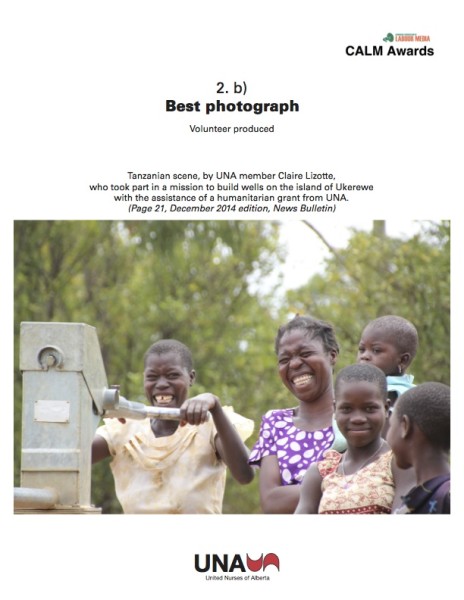
Tanzanian scene, by UNA member Claire Lizotte, who took part in a mission to build wells on the island of Ukerewe with the assistance of a humanitarian grant from UNA. She lived there between 2003-2005 and returned to build wells on the island last year.
This photo is excellence in photojournalism. Because Claire has meaningful relationships with the people in the photo, there’s a closeness to the candid shot. This moment of connection and happiness is impossible to reproduce in a staged photo, and reminds us that union members work for community impact in many places. Almost of the photos submitted in this category were about community involvement, but Claire’s photo zooms us right into the story.
Freeperson award. Staff Produced.
 WINNER: Flying High, AUPE. Albert Union of Public Employees.
A fantastic infographic. It’s well-researched, timely, tells a story alongside the facts, and shows excellence in design. This infographic shows how the Progressive Conservative government preferred to spend its money “flying high” instead of investing in public services. The text is witty and clear, and helps the reader connect the dots to the bigger picture about priorities. The extra effort in storytelling and design gives it greater impact: AUPE says the original, smaller version of this infographic was shared over 1300 times and viewed over 60,000 times.
Freeperson award. Staff Produced, Honorable mention: CUPE
Honorable mention to CUPE for an elegant, simple solution to how to best explain investing in public services. This metaphor of trees and growth is easy to explain member-to-member, and readable both online and print. This infographic is part of a larger print publication about the Canadian economy, and it helps to understand the report and make the information memorable.

Freeperson award, Volunteer Produced.
 WINNER: Jason Alward, Ontario Public Service Employees Union.
Humour can be an important tactic in member engagement. For a while in 2014, Ontario PC leader Tim Hudak wasn’t anyone to laugh about as he tried to attack working people – but these cartoons are hilarious. Fantastic artwork and with a message that connects to the interests of OPSEU. Cartoons can be a great way to start a conversation about politics. Congratulations to Jason Alward for sharing his talent, and congratulations to OPSEU for reaching out to the union membership to promote members’ voices.
Excellence in Layout and Design: Staff Produced
WINNER: Professional Employees Association
http://read.uberflip.com/i/329613-the-professional-june-2014
The PEA previously won for print layout in 2013, and they continue to sets the standard for excellence in union print materials. Professional photography, member-focussed content, great typography, attention to details in layout. Each page has a unified feel, and yet each page has a unique approach whether it’s creating historical timelines or integrating historical imagery. The PEA shows balances visuals with excellent longer-form layout to make articles engaging: for example, the recent issue includes an original report on the decline of science researches in the public service. Fantastic work communicating to PEA members.
Honorable Mention: ACTRA
link: ACTRA Magazine
It’s the quality of a magazine you’d expect to pick up on a newsstand. Fantastic photography, stories about the industry, highlights about the role of the union, and feature interviews. The unique landscape, full-colour magazine format stands out.
Honorable Mention: BCIT Faculty and Staff Association
link: http://www.flipsnack.com/bcitfsa/2013-2014-bcit-faculty-staff-association-annual-report.html
Honorable mention to the BCIT FSA who’s using their brand throughout the publication. The publication is modern, clean-looking and does a good job balancing photography, graphics and text for the FSA members.
Honorable Mention:
UFCW CANADA LOCAL 1000A for their newsletter, Spring Connections (2014). Hard copy received.
Honorable mention to the UFCW Canada Local 1000A. What stands out on each page are members’ faces and stories, especially about how the union has impacted their lives. Type, photos, and text combine in a compelling, positive publication
Best Poster: staff. TIE.
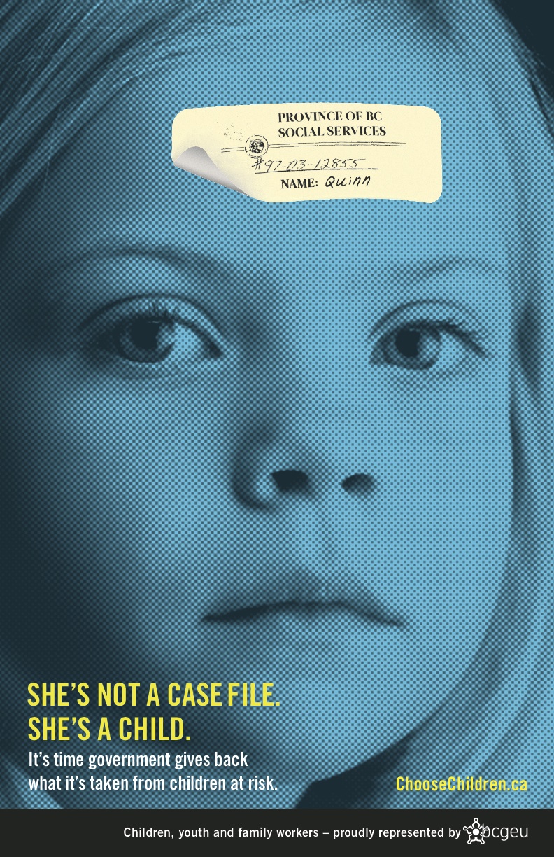 WINNER #1: BCGEU: Choose Children poster
An absolutely unforgettable image. She’s not a case file, she’s a child. The poster puts vulnerable kids right in front of us, and shows that BCGEU is standing up for them. What works about this poster is that the child’s face is full-frame. There’s nothing else in the image to distract us. You have to look into her eyes, and in this looking, you have to think about how she needs you. The poster works at any size, making it a great campaign image.
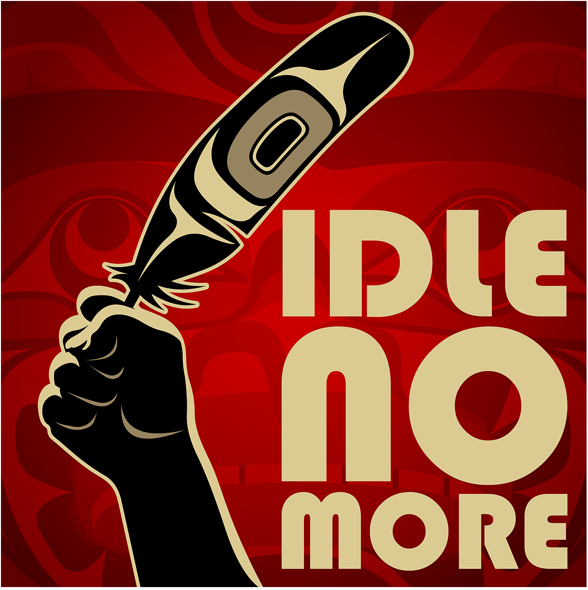
WINNER #2: PSAC. “Idle No More in the struggle for Aboriginal Justice”
What makes this a winning design first, is the process. Aboriginal justice movements and union movements are stronger when they work together. PSAC worked in collaboration with indigenous artist Andy Everson to develop this image about the Idle No More campaign, which promotes indigenous rights and the protection of the environment. The design is easily folded into a slap fan for making noise at demonstrations and events. This poster is now an iconic image for Idle No More. The second part of this winning design is how it contributes to a history of art and culture. There is a historical union tradition of creating original art for posters, and there’s a timeless tradition of Indigenous art from the west coast, and it’s powerful when the two traditions can come together.
Best Poster: volunteer
 Linda Smith, Unifor 88. Promotional poster for an Open House event. Great poster that’s clear, easy to read, and invites you to attend.
Excellence in Layout and Design, Volunteer Produced.
WINNER: OPSEU, In Solidarity. Editor: Virginia Ridley.
Great job balancing photos and text in a volunteer-run publication. Visually the publication is easy to navigate with clear and colorful headers. There’s a range of different images including original photography. In Solidarity balances educational articles with updates on the wide range of interests that are relevant to OPSEU’s diverse membership, and the layout does a great job pulling it all together.
Hardcopy Promo Material
WINNER: CUPE Atlantic, Count me In Campaign
Incredibly creative campaign that puts CUPE Atlantic on the forefront of fighting Healthcare Acquired Infections (HAI) in hospitals. HAI happen when patients get infections in healthcare facilities while they are being treated for something else. CUPE Atlantic designed custom cartoon stickers, sanitizers, and a pop-up tent for a 2014 festival dates that saw them do community outreach at over 16 festivals, ranging from labour day, a pride parade and folk festival. Award winning for its visual appeal, and relevance linking workers’ issues with patient safety, and bringing the topic to greater public awareness.
Honorable mention:
SEIU Healthcare report: Politics Matter! Ask me Why
Fantastic, high-quality print publication report for members. The report features a report on SEIU’s political action for each month, with a short text update, timeline, many photos, and importantly – the impact and results of the actions. The report is an accountability tool for SEIU members to use, and the layout helps makes the connection to how members can “ask me why” politics matter.
——————————
Congratulations to all of the winners!